In a data-driven world, decisions can't wait for manual spreadsheet analysis. The difference between market leaders and followers often comes down to one thing: clarity. Business Intelligence (BI) dashboards provide that clarity, transforming raw data into actionable insights at a glance. But what does an effective dashboard actually look like? Before diving into specific business intelligence dashboard examples, it's beneficial to establish a clear understanding of What is Business Intelligence itself.
This guide moves beyond theory to showcase powerful, real-world dashboards that excel in design, function, and impact. For each example, including selections from Tableau, Power BI, and Domo, we provide screenshots and a direct link. We will dissect what makes each one effective, from the key performance indicators (KPIs) they track to the strategic decisions they enable.
You will learn how to identify elements that drive tangible business growth. We'll even explore how modern AI tools, like the analytics dashboard in My AI Front Desk, make sophisticated data analysis accessible for businesses of all sizes by tracking critical communication metrics like call volume, lead sources, and appointment scheduling success. By the end, you'll have a replicable framework for creating dashboards that deliver results.
My AI Front Desk establishes itself as a premier choice by transforming raw conversational data into a powerful, actionable business intelligence dashboard. It moves beyond simple call logs, offering a sophisticated platform where every customer interaction, from phone calls and SMS to web chat inquiries, is captured, analyzed, and visualized. This provides small businesses with an unprecedented, real-time view of customer engagement, lead generation, and operational efficiency, all within a single, intuitive interface.
This platform excels by making complex data accessible. Instead of requiring a data analyst, business owners can instantly see key performance indicators (KPIs) like call volume, missed vs. answered calls, peak inquiry times, and lead capture rates. These insights are not just numbers; they represent opportunities to optimize staffing, marketing campaigns, and customer service protocols.
The true power of My AI Front Desk lies in its ability to analyze the content of conversations. Using advanced AI models like GPT-4 and Claude, the system can tag calls based on intent, such as "new lead," "appointment booking," or "customer support." This qualitative data is then quantified and displayed on the dashboard, offering a deep understanding of customer needs.
Key Strategic Insight: By automatically categorizing and analyzing every inbound communication, My AI Front Desk provides a direct line to the voice of the customer. Businesses can identify common questions, service gaps, and emerging trends without manually listening to hours of calls.
This level of detail is a significant competitive advantage. For example, a marketing agency can use the dashboard to track which campaign is generating the most qualified inquiries, while a local service business can identify the most frequently requested appointment times to adjust their availability. The platform’s analytics essentially serve as an always-on market research tool.
The dashboard is designed for immediate action, making it one of the most practical business intelligence dashboard examples available for small to medium-sized businesses.
My AI Front Desk stands out with its seamless integration capabilities, connecting with over 9,000 applications, including essential CRMs and scheduling tools like Google Calendar. This ensures that the intelligence gathered on the dashboard flows directly into your existing operational workflows, automating tasks and saving significant time.
Key Features:
Pricing:
My AI Front Desk provides an exceptional blend of cutting-edge AI technology and user-friendly business intelligence, making it an indispensable tool for any business focused on growth and customer satisfaction.
The Tableau Public Gallery is less a single dashboard and more a vast, dynamic library of inspiration. It serves as an extensive repository where the global Tableau community showcases its work. For anyone looking to understand the sheer potential of BI visualization, this is an essential resource. It provides countless real-world business intelligence dashboard examples across every conceivable industry, from finance and healthcare to marketing and sports analytics.
The platform's primary strength lies in its diversity and interactivity. Users can explore complex dashboards, click through different data filters, and see how visualizations change in real time. This hands-on experience is invaluable for learning what makes a dashboard effective and intuitive.
What makes the Tableau Public Gallery a standout resource is its "show, don't just tell" approach to learning. Instead of reading theory, you can directly interact with finished products, deconstruct them, and even download the workbooks to see how they were built. This provides a direct line from inspiration to application.
Key Insight: The gallery demonstrates that the most effective BI dashboards are not just about presenting data; they're about telling a compelling story. The best examples guide the user's eye through a logical narrative, starting with high-level KPIs and allowing them to drill down into the specifics.
To get the most out of this resource, don't just browse. Approach it with a specific goal in mind.
Website: https://public.tableau.com/en-us/gallery/
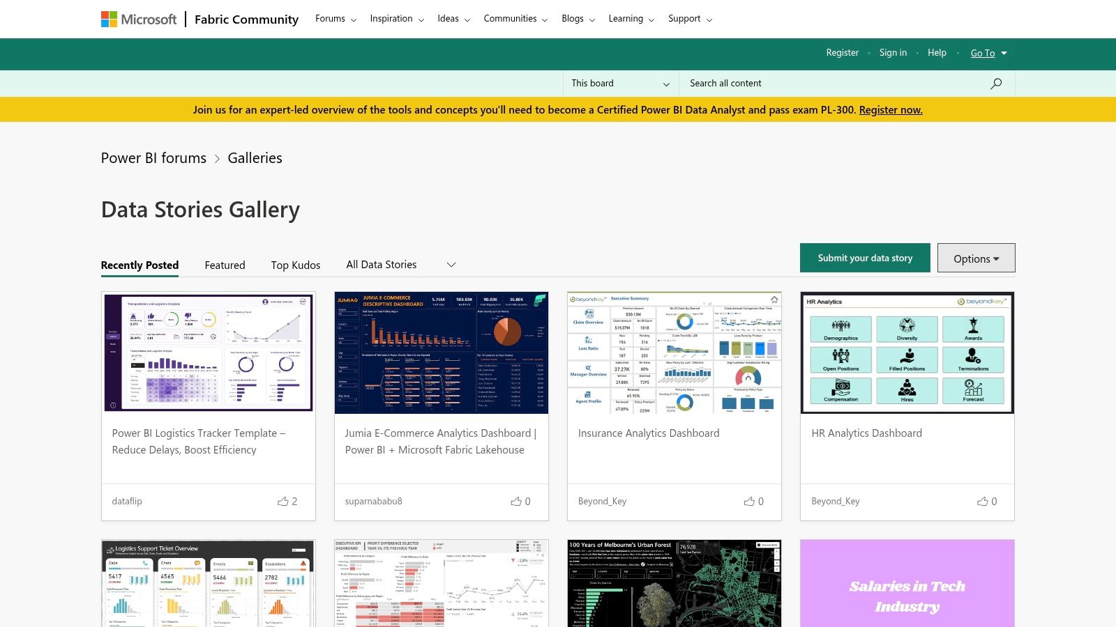
The Microsoft Power BI Community Gallery is a robust, community-driven hub for discovering innovative and practical business intelligence dashboard examples. Similar to Tableau's gallery, this platform acts as a showcase where Power BI users from around the globe share their creations. It is an invaluable resource for anyone seeking inspiration or a tangible starting point for their own BI projects, featuring dashboards across sectors like finance, retail, operations, and human resources.
The gallery's core value is its collaborative and open-source nature. Users can not only view and interact with a wide array of dashboards but also download the source files (.pbix) to see exactly how they were constructed. This hands-on access provides a powerful learning experience for both novice and experienced Power BI developers.
The Power BI Community Gallery excels by bridging the gap between theory and execution. By providing direct access to the underlying .pbix files, it empowers users to go beyond simple observation and engage in active, reverse-engineering-based learning. This practical approach is critical for understanding complex data models, DAX formulas, and visualization techniques.
Key Insight: The gallery proves that an effective BI dashboard is a blend of clean design and a powerful, well-structured data model. The best examples allow users to not only see top-level metrics but also understand the relationships between different data points, leading to deeper, more actionable insights.
To leverage this platform for maximum benefit, it's best to approach it with a clear objective.
Website: https://community.powerbi.com/t5/Data-Stories-Gallery/bd-p/DataStoriesGallery
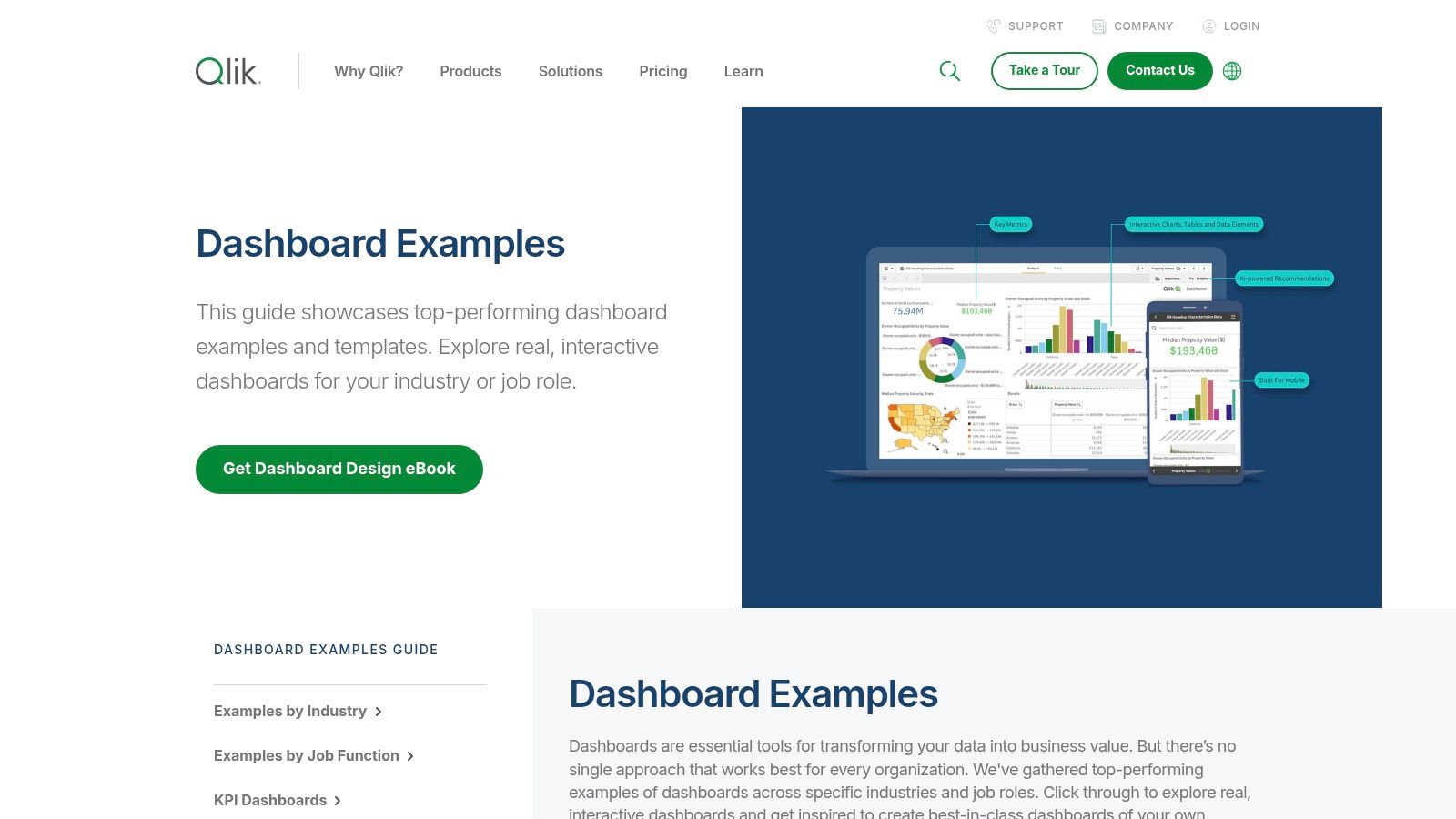
Qlik's collection of dashboard examples provides a curated look into the power of its analytics platform, specifically highlighting its unique associative data model. This gallery is less about community-driven variety and more about demonstrating the platform's core capabilities across different industries and business functions. It's an excellent resource for businesses evaluating Qlik or for users seeking inspiration on how to leverage its specific features for dynamic analysis.
These demos showcase how users can explore data from multiple angles without being confined to predefined drill-down paths. This makes it a compelling source for those looking for advanced, interactive business intelligence dashboard examples that encourage free-form data exploration and discovery.
The standout feature of the Qlik examples is the demonstration of its "Associative Engine." When you click on a data point, you don't just filter the dashboard; you see how all other data points relate to your selection. This immediate contextual insight is a powerful tool for uncovering hidden relationships in your data that might be missed with traditional, linear query-based BI tools.
Key Insight: Qlik's approach proves that true business intelligence isn't just about answering known questions; it's about discovering the questions you didn't know you should be asking. The associative experience guides users toward unexpected correlations and outliers.
To truly grasp the value, you need to interact with the demos as if you were solving a real business problem.
Website: https://www.qlik.com/us/dashboard-examples
InetSoft’s Dashboard Gallery is a curated collection designed to showcase the power and flexibility of its Style Intelligence BI platform. Unlike community-driven repositories, this gallery presents professionally designed dashboards that highlight advanced data visualization techniques and real-world applications across various industries, from telecommunications to healthcare. It provides a focused look at what a single, powerful BI tool can achieve.
The primary advantage of this gallery is its direct demonstration of InetSoft’s capabilities. Users can interact with dashboards, manipulate data filters, and see how complex visualizations respond, all within their web browser. This offers a clear window into how to construct business intelligence dashboard examples that are both visually appealing and functionally robust.
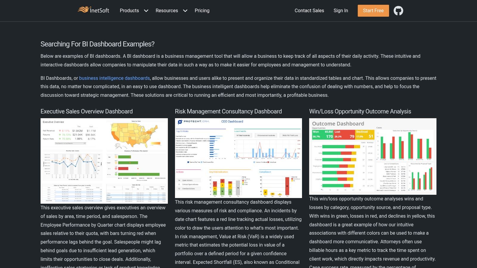
The InetSoft Gallery excels at illustrating the concept of "data mashups," where information from disparate sources is combined into a single, cohesive view. Many examples blend operational data with financial metrics or customer data with supply chain information, demonstrating how a holistic view can uncover deeper, more actionable insights. This is a crucial strategy for businesses looking to break down data silos.
Key Insight: The gallery emphasizes that advanced BI isn't just about pretty charts; it's about the sophisticated data integration happening behind the scenes. An effective dashboard allows users to explore relationships between seemingly unrelated datasets without needing to understand the complex joins and queries powering it.
Use this gallery as a blueprint for designing comprehensive, multi-source dashboards.
Website: https://www.inetsoft.com/info/bi_dashboard_examples/
Domo's gallery provides a curated look into what a highly integrated BI platform can achieve. Instead of a public, user-generated forum, Domo presents a polished collection of business intelligence dashboard examples tailored to specific business functions like marketing, finance, and operations. This approach highlights the platform's core strengths: connecting disparate data sources and delivering clear, actionable insights in a unified view.
The main advantage here is the focus on real-world business applications. Each example is designed to solve a specific problem, from tracking marketing ROI to monitoring supply chain efficiency. This makes the gallery an excellent resource for business leaders who want to see direct solutions rather than just abstract data visualizations.
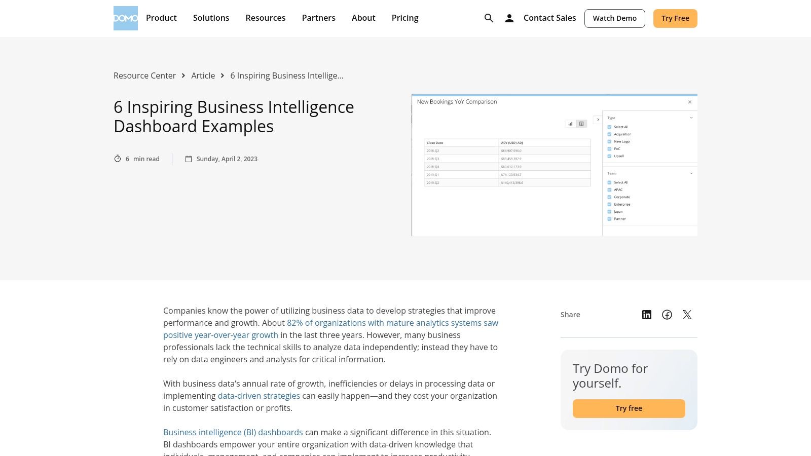
Domo's examples shine by demonstrating the power of a single source of truth. The dashboards showcase how data from CRM, ERP, and marketing automation tools can be combined to create a holistic view of business performance. This is a critical capability for any organization looking to break down data silos between departments.
Key Insight: The most powerful dashboards connect operational metrics directly to financial outcomes. Domo's examples excel at this, showing, for instance, how a change in website traffic (marketing data) impacts lead generation (sales data) and ultimately revenue (finance data).
Use these polished examples as a blueprint for your own strategic dashboards, focusing on cross-functional reporting.
Website: https://www.domo.com/learn/article/6-inspiring-business-intelligence-dashboard-examples
Hevo Data offers a curated gallery that acts as a guided tour through the capabilities of Microsoft Power BI. Rather than presenting a massive, unfiltered library, Hevo provides a collection of well-vetted business intelligence dashboard examples, each accompanied by detailed descriptions and strategic context. This approach is ideal for professionals who want to understand not just what a dashboard looks like, but why it was designed a certain way for a specific business function.
The collection highlights Power BI's flexibility across diverse departments, including finance, human resources, and sales. By focusing on specific use cases, Hevo's resource helps bridge the gap between seeing a powerful visualization and understanding how to apply it to your own business challenges. It’s a practical, educational resource for those specifically interested in the Microsoft BI ecosystem.
Hevo Data's strength is its curated, educational approach. Instead of leaving users to browse aimlessly, it provides context for each example, explaining the key metrics, the target audience, and the business questions the dashboard is designed to answer. This makes it an excellent starting point for teams new to Power BI or for those looking for proven templates to adapt.
Key Insight: A successful BI dashboard is purpose-built. Hevo’s examples demonstrate that a dashboard designed for a CFO to track financial health will prioritize different metrics and visualizations than one built for an HR manager to monitor employee performance. The curation reinforces the importance of audience-centric design.
Use this gallery as a blueprint for your own Power BI projects. The goal is to learn from established best practices before you start building.
Website: https://hevodata.com/learn/top-10-best-power-bi-dashboard-examples-in-2021/
We have journeyed through a diverse collection of powerful business intelligence dashboard examples, moving from specialized tools like the My AI Front Desk analytics dashboard to broad, community-driven galleries from Tableau and Microsoft Power BI. The common thread connecting every effective dashboard is its strategic purpose. A truly great BI dashboard is far more than a visually appealing collage of charts; it is a focused, interactive command center built to answer specific business questions and drive decisive action.
The most compelling dashboards, as we've seen, strike a critical balance. They present high-level, at-a-glance Key Performance Indicators (KPIs) for leadership while simultaneously offering the granularity needed for frontline teams to drill down and uncover root causes. This principle of clarity over complexity is universal. Whether you're an entrepreneur tracking customer acquisition costs or a call center manager monitoring agent performance, the goal is to transform raw data into a clear narrative that anyone can understand and act upon.
As you move from inspiration to implementation, keep these fundamental takeaways at the forefront of your planning:
The right tool depends entirely on your specific context, resources, and technical expertise. Platforms like Tableau and Power BI offer immense customization and power but come with a steeper learning curve. For a deeper dive into the practical application of analytics tools and visualizing performance, consider exploring insights on mastering modern analytics dashboards to see how these concepts apply across different digital channels.
On the other hand, purpose-built solutions offer a more direct path to value. Tools with integrated analytics, like My AI Front Desk, democratize business intelligence by providing a pre-configured dashboard tailored to a specific function, such as managing customer communications. This approach removes the complexity of setup and allows you to focus immediately on the insights.
The journey to data-driven decision-making starts with a single, well-designed dashboard. Use the business intelligence dashboard examples in this guide as your blueprint, adapt their strategic principles to your unique challenges, and begin building the tools that will empower your team to achieve its goals with confidence and clarity.
Ready to see how a purpose-built dashboard can transform your customer communications? The analytics dashboard from My AI Front Desk turns complex call data into simple, actionable insights, helping you optimize staffing, understand customer needs, and capture every opportunity. Explore My AI Front Desk to see how easy it is to get started.
Start your free trial for My AI Front Desk today, it takes minutes to setup!


