In today's competitive landscape, collecting data is easy; turning it into an actionable strategy is the real challenge. This is where business intelligence (BI) dashboards come in. They transform raw numbers into a clear visual narrative, empowering teams to make smarter, faster decisions.
However, not all dashboards are created equal. An effective BI dashboard isn't just a collection of charts; it's a strategic tool designed to answer critical business questions at a glance. It should tell a story about performance, highlight opportunities, and flag potential issues before they escalate.
This article explores 7 powerful business intelligence dashboard examples that excel at this. We move beyond generic templates to dive deep into what makes these dashboards effective, analyzing the strategic thinking behind their design and the key metrics they track. For each example from platforms like Coupler.io and Senturus, we provide screenshots, direct links, and a strategic breakdown. You'll discover how to apply these principles to create your own high-impact dashboards.
Whether you're in marketing, sales, operations, or finance, these examples will provide the inspiration and actionable tactics needed to transform your data into a true competitive advantage.
Coupler.io’s blog carves out a unique niche by offering not just inspiration, but fully functional, downloadable Power BI templates. This platform acts as a powerful accelerator for businesses looking to implement sophisticated BI without building everything from scratch. It provides a rich library of ready-to-use dashboards tailored for specific business needs like marketing, e-commerce, and web analytics.
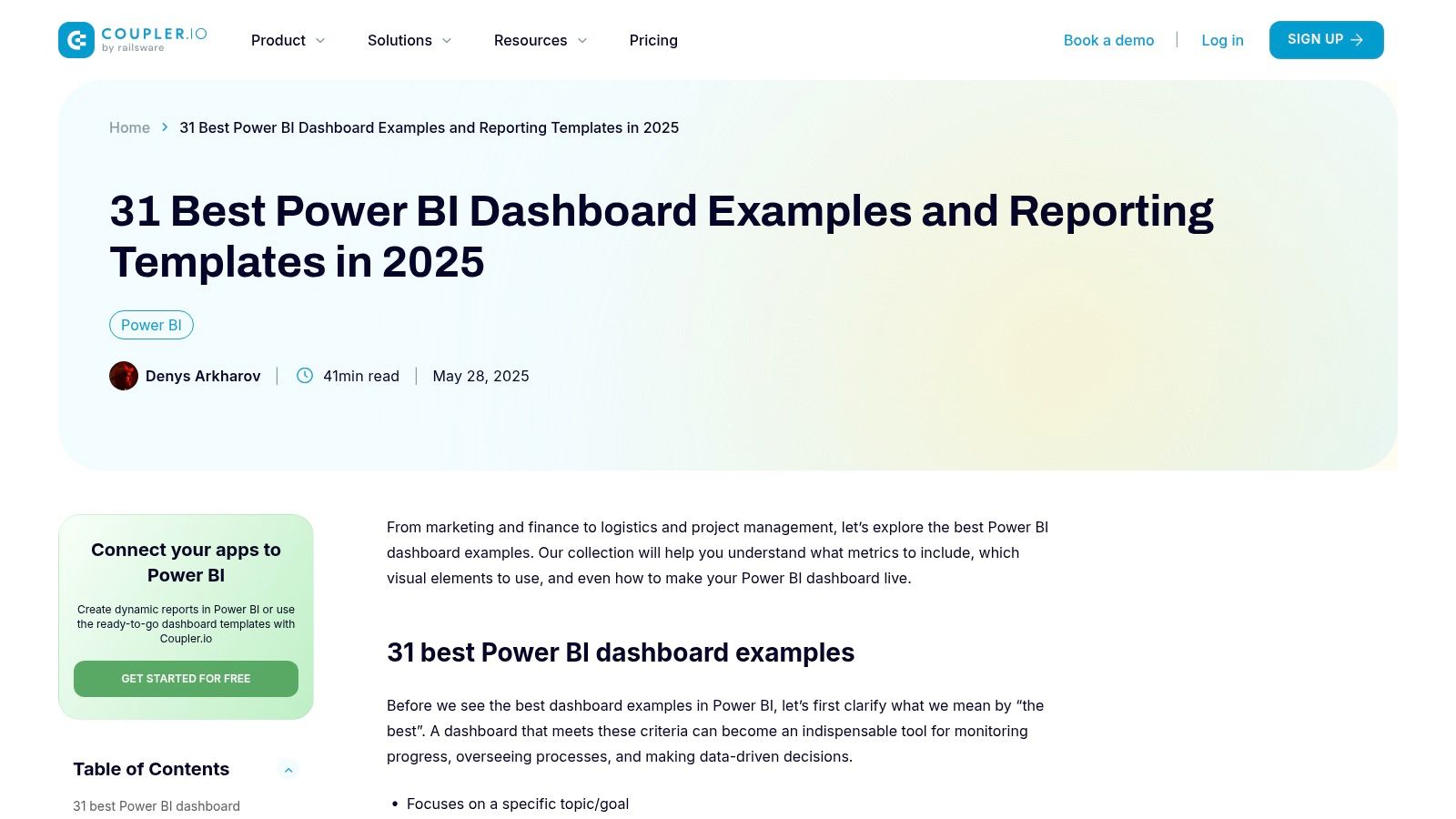
The primary strength of Coupler.io lies in its practicality. While many sites show you what a great dashboard looks like, Coupler.io gives you the actual file, complete with connections ready for your data. This approach significantly lowers the barrier to entry for small businesses and marketing teams that may lack dedicated BI developers. By providing these business intelligence dashboard examples, they empower users to quickly visualize their own data with proven layouts.
What makes this resource stand out is the integration with the core Coupler.io data automation product. The templates are designed to work seamlessly with their service, which automates data transfers from over 70 sources into destinations like Power BI, Google Sheets, or BigQuery.
Key Strategic Insight: Coupler.io's strategy is to use high-value content (free, downloadable templates) as a direct funnel to its core SaaS product. They solve the user's immediate problem of "How do I build this dashboard?" while introducing them to a long-term solution for data management and automation.
The templates themselves are clean, focused, and built around specific key performance indicators (KPIs). For example, their Google Analytics 4 dashboard template visualizes traffic sources, user engagement, and conversion events, allowing marketers to get an instant, comprehensive overview without manual setup. For businesses looking to enhance their reporting capabilities, exploring tools like Coupler.io alongside automated customer service solutions can create a highly efficient operational ecosystem. Find out how AI can further streamline your front-desk operations by exploring this resource on Novi.
.PBIX file and connect it to your own data sources using the Coupler.io service.Coupler.io’s blog carves out a unique niche by offering not just inspiration, but fully functional, downloadable Power BI templates. This platform acts as a powerful accelerator for businesses looking to implement sophisticated BI without building everything from scratch. It provides a rich library of ready-to-use dashboards tailored for specific business needs like marketing, e-commerce, and web analytics.
The primary strength of Coupler.io lies in its practicality. While many sites show you what a great dashboard looks like, Coupler.io gives you the actual file, complete with connections ready for your data. This approach significantly lowers the barrier to entry for small businesses and marketing teams that may lack dedicated BI developers. By providing these business intelligence dashboard examples, they empower users to quickly visualize their own data with proven layouts.
What makes this resource stand out is the integration with the core Coupler.io data automation product. The templates are designed to work seamlessly with their service, which automates data transfers from over 70 sources into destinations like Power BI, Google Sheets, or BigQuery. This creates a powerful, interconnected ecosystem where the dashboard is not just a static report but a living tool updated automatically.
Key Strategic Insight: Coupler.io's strategy is to use high-value content (free, downloadable templates) as a direct funnel to its core SaaS product. They solve the user's immediate problem of "How do I build this dashboard?" while introducing them to a long-term solution for data management and automation.
The templates themselves are clean, focused, and built around specific key performance indicators (KPIs). For example, their Google Analytics 4 dashboard template visualizes traffic sources, user engagement, and conversion events, allowing marketers to get an instant, comprehensive overview without manual setup. For businesses looking to enhance their reporting capabilities, exploring tools like Coupler.io alongside automated customer service solutions can create a highly efficient operational ecosystem. Find out how AI can further streamline your front-desk operations by exploring this resource on Novi.
.PBIX file and connect it to your own data sources using the Coupler.io service.Senturus offers a unique, comparative approach with its Dashboard Gallery, showcasing a collection of interactive business intelligence dashboard examples built on leading platforms like Power BI, Tableau, and IBM Cognos Analytics. This resource serves as an invaluable educational hub for decision-makers and analysts who are not only seeking design inspiration but are also in the critical phase of evaluating and selecting a BI tool. It allows users to see firsthand how the same data story can be told through different technological lenses.
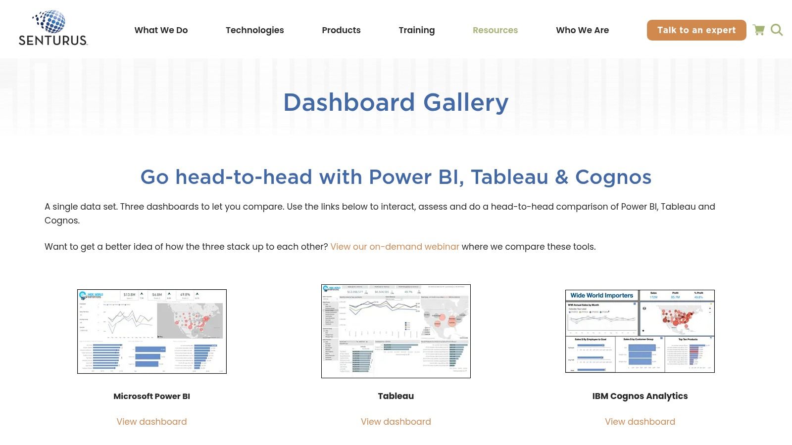
The gallery’s primary strength lies in its ability to facilitate a side-by-side comparison of BI tools in a real-world context. Rather than relying on feature lists or marketing materials, users can interact with fully functional, industry-specific dashboards. This hands-on experience demystifies the capabilities of each platform, highlighting differences in user interface, interactivity, and overall aesthetic.
Senturus, a business intelligence and analytics consultancy, uses its gallery as a powerful demonstration of its multi-platform expertise. The dashboards are not just random examples; they are carefully crafted artifacts that showcase practical applications in finance, sales, and operations. This approach positions Senturus as a knowledgeable, tool-agnostic partner.
Key Strategic Insight: Senturus's strategy is to attract potential clients by providing a high-value, interactive "try before you buy" experience for BI platforms. By showcasing their proficiency across Power BI, Tableau, and Cognos, they establish credibility and capture leads from organizations at the crucial tool-selection stage of their analytics journey.
The interactive nature of the gallery is a significant advantage. Users can click, filter, and drill down into the data, providing a much richer understanding of effective dashboard design than static images ever could. By exploring how graphic design principles can elevate data storytelling, companies can create more impactful visualizations. Discover how to transform your data visualization through strategic graphic design with insights from this article.
Sunflower Lab showcases the power of business intelligence when applied to a highly specific and critical business function: procurement. Their examples focus entirely on Power BI purchase dashboards, offering a deep dive into company spending, vendor performance, and cost management. This specialization provides a clear, actionable blueprint for any organization looking to gain granular control over its procurement cycle.
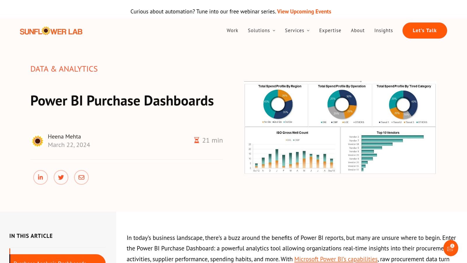
The primary strength of Sunflower Lab’s approach is its laser focus on tangible financial outcomes. While many business intelligence dashboard examples cover broad operational views, these are designed to answer specific, high-value questions like "Where are we overspending?" and "Which vendors provide the best value?". By visualizing data such as purchase document counts, invoiced quantities versus received quantities, and cost trends, they turn complex procurement data into a strategic asset for identifying savings opportunities.
Sunflower Lab’s gallery serves as a portfolio and inspiration hub, demonstrating their expertise in custom BI solutions. They illustrate how raw data from ERP or accounting systems can be transformed into interactive dashboards that drive better purchasing decisions. The examples effectively highlight key metrics like monthly purchase values, average costs per item, and vendor-specific analytics.
Key Strategic Insight: Sunflower Lab uses these detailed, niche dashboard examples not as downloadable products, but as a proof of concept to attract clients for their custom development services. They demonstrate their capability to solve a specific, costly business problem, positioning themselves as expert consultants rather than just a template provider.
This strategy is effective for businesses that need a solution tailored precisely to their existing systems and procurement workflows. The dashboards are designed with a clean interface, using filters for items, vendors, and general ledger accounts, making the analysis intuitive for finance and procurement teams who may not be BI experts.
DataCamp positions itself as an educational hub for BI professionals, and its blog on Power BI dashboard examples is a testament to this mission. Instead of offering downloadable files, DataCamp provides a curated showcase of dashboard designs, breaking down why they are effective. This resource is ideal for those who want to learn the principles behind great data visualization to build their own custom solutions.
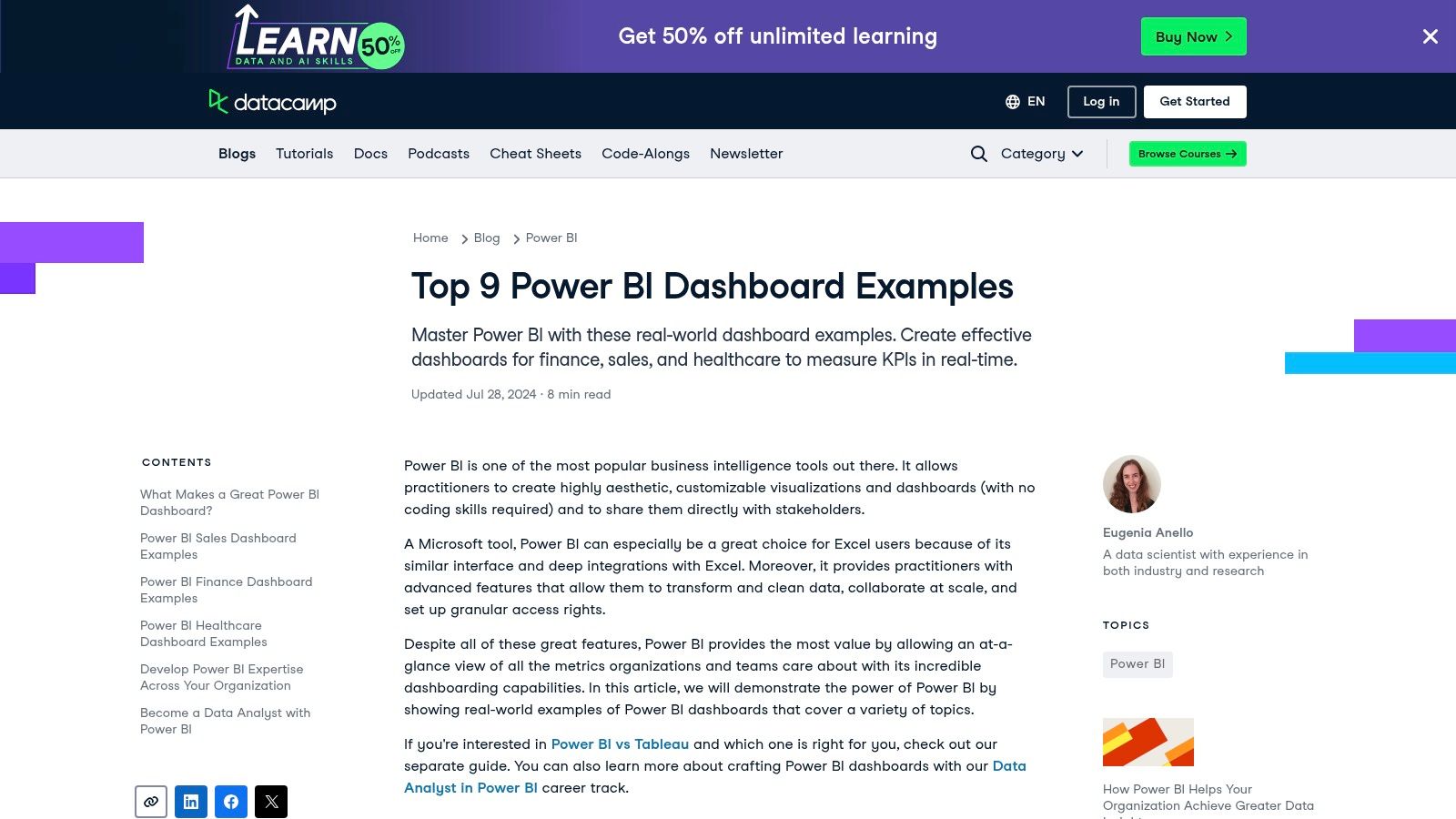
The primary strength of DataCamp's showcase lies in its detailed, instructional breakdowns. Each example, from e-commerce sales to retail analytics, is accompanied by an explanation of its layout, choice of charts, and the story it tells. This approach is less about quick implementation and more about building a foundational understanding of data storytelling, empowering users to move beyond templates and create truly bespoke business intelligence dashboard examples.
DataCamp's strategy is centered on content marketing that reinforces its core product: data science and analytics education. The dashboard examples serve as a practical application of the theoretical concepts taught in their courses. They inspire and educate simultaneously, drawing in aspiring data analysts and BI developers.
Key Strategic Insight: DataCamp uses its blog as a top-of-funnel educational tool. By showcasing best-in-class dashboard designs and explaining their strategic value, it establishes authority and piques user interest in acquiring the skills needed to build them, naturally leading users toward its paid courses and platform.
The examples provided are diverse and cover critical business functions. For instance, a human resources dashboard might focus on employee turnover rates and satisfaction scores, while a marketing dashboard visualizes campaign ROI and lead conversion funnels. This industry-specific context helps users connect visualization techniques to their own professional challenges. Agency owners can discover how to transform raw numbers into compelling narratives by exploring how to use data analytics for marketing success.
BI4Dynamics provides a highly specialized business intelligence dashboard example tailored specifically for organizations using Microsoft Dynamics. Its Purchase Dashboard is a masterclass in vertical BI, offering deep, real-time insights into the entire procurement lifecycle. The platform is designed not as a general-purpose tool but as a powerful, integrated analytics layer for Dynamics, tracking everything from vendor performance to stock levels and delivery efficiency.
The core strength of BI4Dynamics is its seamless, native integration. For companies embedded in the Microsoft ecosystem, this eliminates the complex data mapping and connector issues that often plague third-party BI implementations. It provides a plug-and-play analytics solution that speaks the same language as their core ERP, enabling immediate access to granular data on purchase orders, item receipts, and vendor payment terms. This focus makes it an indispensable tool for supply chain managers and procurement officers.
BI4Dynamics’s go-to-market strategy hinges on solving a very specific, high-value problem for a well-defined audience: Microsoft Dynamics users who need better purchasing analytics. Rather than competing with broad platforms like Tableau or Power BI, it provides a pre-built solution that dramatically accelerates time-to-value for this niche. The dashboard is designed around key procurement KPIs, such as Purchase Amount by Vendor, Top 10 Items by Purchase, and Delivery Timeliness.
Key Strategic Insight: BI4Dynamics leverages a "solution-in-a-box" approach for a specific ERP ecosystem. By pre-building the data models, calculations, and visualizations for Dynamics, they transform a months-long BI project into a rapid deployment, capturing a market segment that prioritizes speed and integration over customizability.
This targeted approach offers a clear advantage by providing immediate, actionable insights without requiring extensive in-house development. The dashboard comes populated with industry-standard metrics, allowing users to benchmark performance and identify cost-saving opportunities right away. The platform’s value is in its depth, not its breadth, a crucial distinction in the crowded BI market.
InetSoft Technology provides a comprehensive gallery of business intelligence dashboard examples that serve as a powerful source of inspiration for various industries and departments. Rather than offering downloadable files, InetSoft's approach is to showcase the art of the possible, demonstrating how complex data from help centers, risk management, and demographic analysis can be transformed into interactive, easy-to-understand visualizations. Their gallery highlights the flexibility and power of modern BI tools.
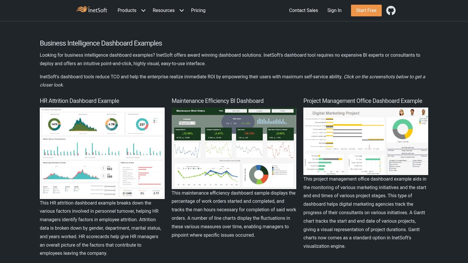
The primary strength of InetSoft's showcase is its breadth. The examples cover highly specific use cases, such as a Help Center Management Dashboard tracking ticket resolution times and agent performance, or a Risk Analysis Dashboard for financial services. This specificity helps managers and analysts envision exactly how a BI solution could be tailored to solve their unique challenges, making it an excellent resource for the initial stages of a BI project.
InetSoft’s strategy focuses on demonstrating its platform's capability to build highly customized, interactive, and real-time dashboards. The examples are not just static images; they are live, interactive demos that allow users to click, filter, and drill down into the data. This hands-on experience effectively sells the value of their underlying BI software, Style Intelligence.
Key Strategic Insight: InetSoft uses its example gallery as a consultative sales tool. By showcasing a wide variety of sophisticated, industry-specific solutions, they attract high-intent leads who are looking for a powerful, customizable BI platform rather than a simple, off-the-shelf template. The gallery acts as a portfolio of their platform's power.
Their dashboards effectively visualize key metrics across different business functions. For instance, a lead conversion dashboard would break down the sales funnel from initial contact to closed deal, helping teams pinpoint bottlenecks. Just as analytics can drive lead conversion, a dedicated social media analytics dashboard is essential for understanding your online presence and optimizing engagement.
Throughout this article, we've explored a diverse collection of powerful business intelligence dashboard examples. From the broad, inspirational galleries offered by Senturus and DataCamp to the highly specialized, tactical tools from BI4Dynamics and InetSoft, a single, powerful principle unites them all: strategic design precedes effective data visualization. The most impactful dashboards are not just collections of charts; they are purpose-built decision-making engines.
The journey from raw data to actionable insight begins with a clear objective. The critical takeaway from these examples is to define your business goals before you even think about connecting a data source. What specific outcome do you need to influence? Is it reducing customer churn, optimizing marketing spend, or improving operational efficiency in your call center? Start with that core question.
The best dashboards translate complex data into clear, strategic narratives. To build one that truly empowers your team, focus on these foundational principles drawn from the examples we analyzed:
Moving from inspiration to implementation requires a structured approach. Use the examples in this guide not as rigid templates but as a strategic blueprint.
Our article explores how to build strategic dashboards that go beyond simple data presentation. To further optimize your enterprise dashboard, it's crucial to align every visual element with your company's core strategic objectives, ensuring your dashboard becomes a true command center for performance. This focus on strategic steering ensures that your data visualization efforts translate directly into measurable business growth and improved decision-making across all departments.
The examples we've reviewed prove that a well-crafted dashboard is more than a report; it’s a catalyst for strategic conversation and a cornerstone of a data-driven culture. By focusing on action over mere analysis, you can transform your data from a passive resource into your most powerful strategic asset.
Ready to capture and analyze every lead from your most important channel, your phone lines? My AI Front Desk acts as your 24/7 virtual receptionist, logging every call, transcribing conversations, and providing a powerful analytics dashboard to track call volume, peak times, and customer sentiment. Start turning your phone calls into actionable business intelligence with My AI Front Desk today.
Start your free trial for My AI Front Desk today, it takes minutes to setup!


